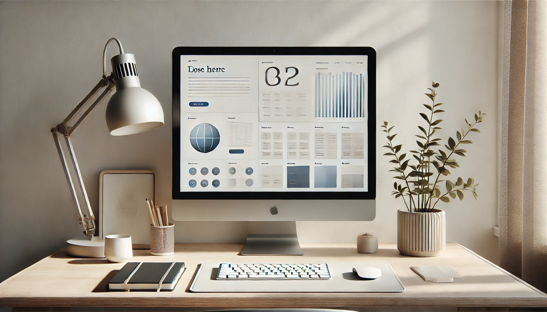
Minimalist design is an approach that values simplicity and functionality. Based on the concept of “less is more,” this design style uses few visual elements, but strategically places them to create impact and communicate clear messages. For beginner designers, adopting this philosophy can be an excellent starting point, as it reduces complexity and helps focus on the fundamental principles of design.
In this article, we will explore how to create minimalist layouts that are both simple and elegant.
What is Minimalist Design?
Minimalist design emerged in the 20th century as a response to the excessive ornamentation of traditional design. Inspired by the modernist movement and influenced by the Bauhaus style, it emphasizes functionality by eliminating unnecessary elements.
The main characteristics of minimalist design include:
- Use of white space: Allows visual elements to “breathe.”
- Limited core palettes: Focus on neutral tones and simple symbols.
- Clean typography: Sans-serif fonts are common, as they communicate clearly.
- Reduced elements: Each component should serve a specific function.
Benefits of Minimalist Design
- Ease of navigation: In user interfaces, a clean design improves usability.
- Modern aesthetics: Minimalism is often associated with sophistication.
- Clear communication: Without distractions, the main message stands out.
- Versatility: This style can be applied to websites, logos, packaging, and printed materials.
How to Create Minimalist Layouts
1. Understand the Project’s Objective
Before starting, ask yourself: What is the main message the design should convey? In minimalism, every element must have a reason to be in the layout. Any item that doesn’t directly contribute to the objective should be removed.
Tip: Brainstorm to identify the essential elements before starting the design.
2. Master White Space
White space, or negative space, is one of the most powerful tools in minimalist design. It creates contrast, enhances readability, and highlights key elements.
Practical example: In a website layout, use white space around text and images to create a visually clear design.
3. Choose a Limited Color Palette
In minimalism, fewer core colors mean more impact. Choose one or two main colors and complement them with neutral tones such as white, black, and gray.
Useful tools:
- Coolors (color palette generator)
- Adobe Color
Application tip: If you’re creating a corporate design, use the brand’s core colors as a base and reduce the use of additional tones.
4. Clean and Functional Typography
Choosing the right typography is crucial in minimalist design. Opt for simple and legible fonts. Avoid using more than two font families in the same project to maintain visual harmony.
Recommended fonts:
- Helvetica
- Open Sans
- Roboto
- Montserrat
5. Create a Clear Visual Hierarchy
Visual order helps the audience understand the importance of different elements. Use font sizes, typographic weights, and colors to guide the user’s eyes.
Example:
- Larger and bold titles.
- Smaller and regular captions.
- Standard size body text.
6. Apply the Principles of Symmetry and Alignment
Proper alignment is essential for creating balanced layouts. Use grids and guides to align elements visually.
Tools for precise alignment:
- Figma
- Adobe Illustrator
- Sketch
Examples of Successful Minimalist Design
Apple
Apple is a reference in minimalist design, both in its products and advertising campaigns. The use of white backgrounds, clean images, and concise text communicates luxury and functionality.
Muji
The Japanese brand Muji applies minimalism in its packaging and stores, creating a visually calm experience that reflects its philosophy of simplicity.
Common Mistakes in Minimalist Design
- Confusing simplicity with monotony: A minimalist design still needs to be visually appealing. Use contrasts and strategic visual elements to maintain interest.
- Neglecting functionality: Ensure the design doesn’t hinder usability.
- Excessive reliance on white space: Too much empty space can make the design feel incomplete.
Final Tips for Beginners
- Practice with personal projects: Try recreating well-known designs in a minimalist style to gain hands-on experience.
- Learn from references: Platforms like Behance and Dribbble are great places to find inspiration.
- Seek feedback: Share your designs with other professionals to continually improve.
Conclusion
Minimalist design is a timeless approach that values functionality and aesthetics. To create simple and elegant layouts, focus on the basic principles, such as the use of white space, clean typography, and limited colors. With practice and attention to detail, you’ll be able to master this style and create projects that impress.
Ready to apply these tips to your next project?

