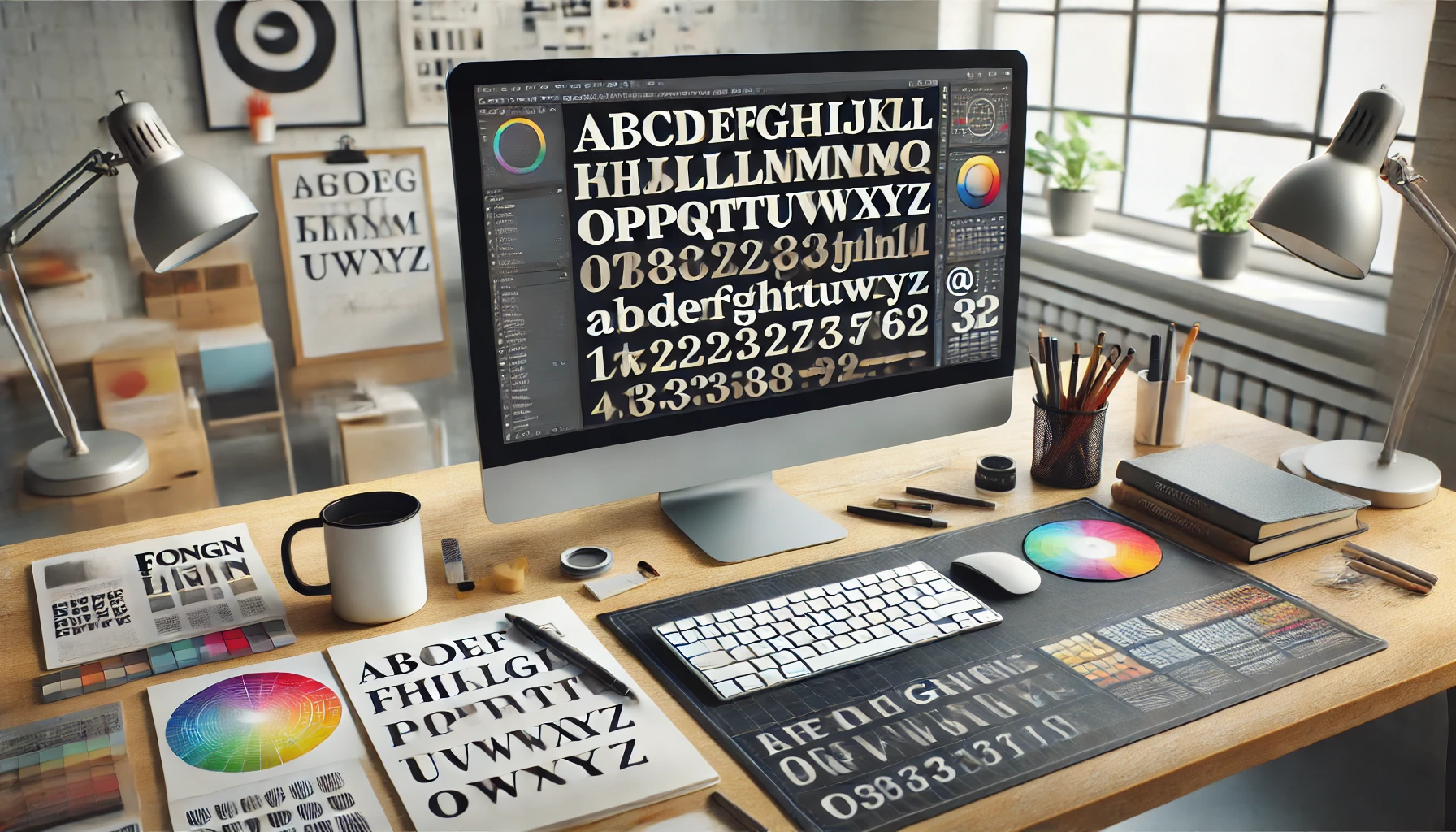
Selecting the right fonts is essential for creating cohesive and effective designs. A good font combination not only improves readability but also conveys the right tone for your message. However, finding fonts that complement each other can be challenging, especially for beginners.
In this article, you’ll learn how to choose and combine fonts harmoniously, along with practical tips for applying them in your projects.
Why Font Choice Matters
- Defines the Tone: Typography communicates the personality of the design, whether formal, casual, or creative.
- Ensures Readability: Well-chosen fonts make the text easier to read.
- Creates Visual Hierarchy: Different fonts help highlight important information.
💡 Example: A wedding invitation might use elegant, cursive fonts to convey sophistication.
1. Understand the Purpose of Your Design
Before choosing fonts, consider:
- Target Audience: Who will be consuming the content?
- Design Goal: Is the purpose to inform, sell, or entertain?
- Display Medium: Will it be printed, displayed digitally, or both?
💡 Tip: Digital projects call for clean, legible fonts like sans-serif, while print materials may use serif fonts for added elegance.
2. Understand the Main Types of Fonts
Serif Fonts
- Characteristics: Small “extensions” at the ends of letters.
- Style: Traditional and sophisticated.
- Uses: Books, newspapers, corporate identities.
💡 Example: Times New Roman, Georgia.
Sans-Serif Fonts
- Characteristics: Clean lines without extensions.
- Style: Modern and minimalist.
- Uses: Websites, apps, posters.
💡 Example: Arial, Helvetica, Open Sans.
Script Fonts
- Characteristics: Mimic handwritten calligraphy.
- Style: Creative and personal.
- Uses: Invitations, logos, craft designs.
💡 Example: Pacifico, Dancing Script.
Display Fonts
- Characteristics: Bold and decorative.
- Style: Eye-catching and expressive.
- Uses: Titles, banners, magazine covers.
💡 Example: Lobster, Bebas Neue.
3. Stick to 2 or 3 Fonts
Avoid overwhelming your design with too many font choices.
- Primary Font: For titles and headings.
- Secondary Font: For body text or subtitles.
- Tertiary Font (Optional): For highlights or call-to-action elements.
💡 Tip: Simple combinations are more elegant and effective.
4. Combine Contrasting Fonts
Mixing contrasting fonts creates visual interest.
- Serif + Sans-Serif: A classic and balanced combination.
Example: Playfair Display (serif) with Lato (sans-serif). - Script + Sans-Serif: Great for modern, creative designs.
Example: Pacifico (script) with Montserrat (sans-serif).
💡 Tip: Experiment with different styles to find the ideal contrast.
5. Adjust Size and Spacing
Proper size and spacing adjustments are crucial for maintaining readability.
- Headings: Should be larger and more prominent.
- Body Text: Use sizes between 10-14 pt for legibility.
- Line Spacing: Adjust to avoid overly tight or too spread-out text.
💡 Useful Tool: Use Google Fonts to test font combinations.
6. Choose Fonts with Good Readability
Ensure your fonts are easy to read, especially for digital projects.
- Avoid overly decorative fonts for body text.
- Test fonts at different sizes to ensure clarity.
💡 Example: Roboto and Open Sans are great for screen readability.
7. Use Tools to Find Font Combinations
- Google Fonts: Offers suggested font pairs and allows you to preview them together.
- FontPair: Helps you find harmonious font combinations.
- Canva Font Combinations: A Canva tool that suggests ready-to-use font pairs.
8. Consider the Visual Identity
Ensure that the fonts you choose align with the visual identity of your project.
- Formal and Elegant: Serif fonts work well.
- Creative and Modern: Use sans-serif or script fonts.
💡 Tip: Choose a color palette that complements the fonts to reinforce the style.
9. Avoid Similar Font Combinations
Fonts that are too similar can cause visual confusion.
Choose fonts with clear differences in style or weight.
💡 Bad Example: Using Arial and Helvetica together in the same design.
10. Experiment Before Finalizing
Try different combinations until you find the best one.
- Visualize the fonts in the context of your design.
- Get feedback from colleagues or friends to assess your choice.
💡 Tip: Don’t be afraid to try new styles and step outside your comfort zone.
Conclusion: Typography That Impresses
Choosing the right fonts is a skill that improves with practice and attention to detail. With the tips and tools provided, you can create combinations that not only look visually pleasing but also communicate the right message to your audience.

