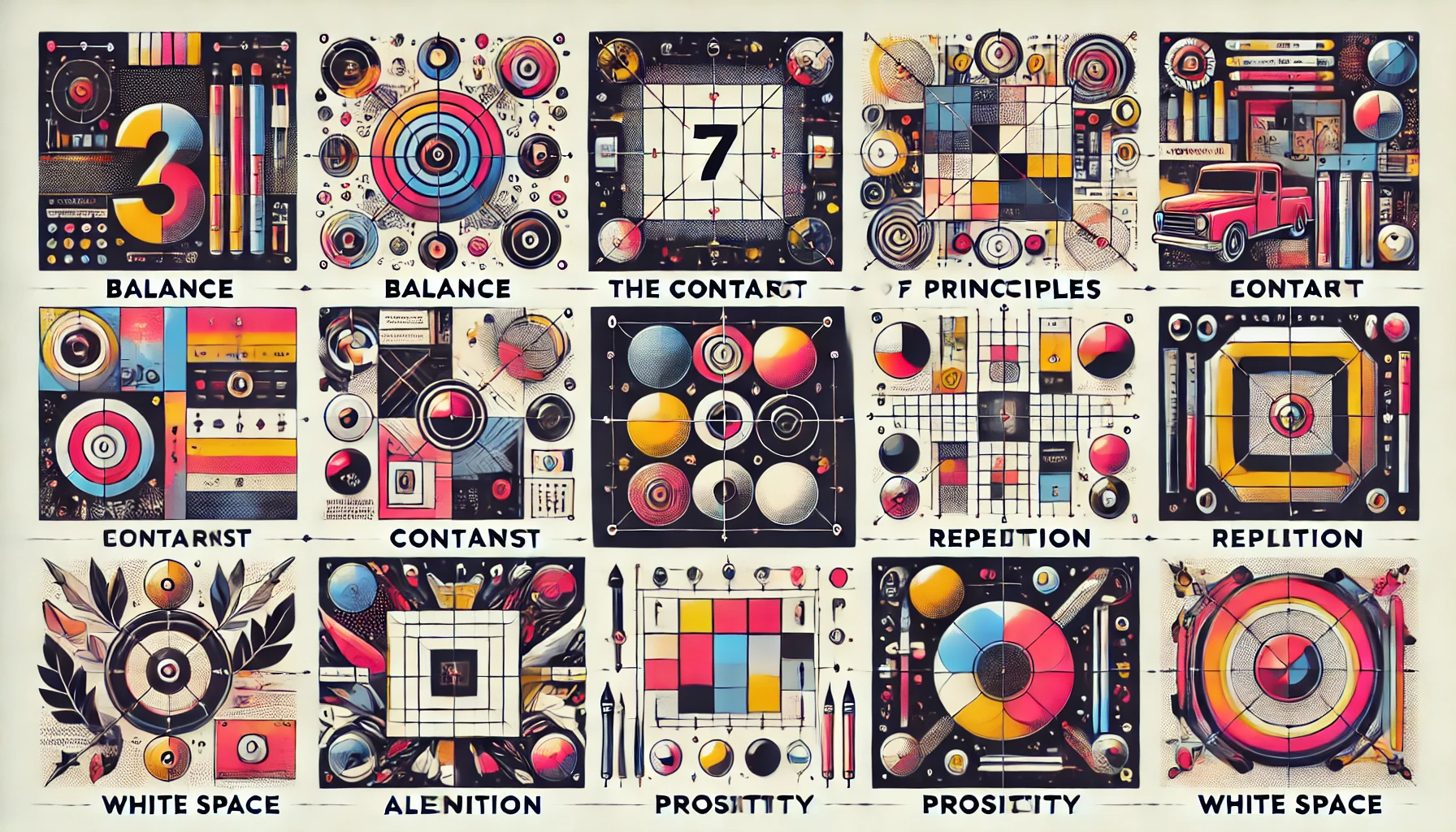
Graphic design is more than just arranging images and text—it’s about creating visual communication that is clear, engaging, and impactful. The foundation of any successful design lies in mastering its basic principles. These principles guide designers in creating balanced and harmonious compositions.
This article explores the 7 essential graphic design principles every beginner should know to elevate their creative work.
1. Balance
Balance refers to the distribution of visual elements to create stability in a design. It ensures that no single element overwhelms the composition.
Types of balance:
- Symmetrical balance: Elements are evenly distributed, creating a formal and structured design.
- Asymmetrical balance: Uneven distribution of elements that still results in a visually pleasing effect.
- Radial balance: Elements radiate from a central point, often creating a dynamic effect.
Tips:
- Use a grid system to achieve balance.
- Avoid overloading one side of the design with too many elements.
2. Contrast
Contrast is about creating differences between elements to make them stand out. It helps direct the viewer’s attention to key areas.
Examples of contrast:
- Color contrast: Combine light and dark tones (e.g., white text on a black background).
- Size contrast: Use larger fonts for headlines and smaller fonts for body text.
- Shape contrast: Combine geometric shapes with organic shapes.
Tips:
- Ensure contrast enhances readability and doesn’t overwhelm the design.
- Experiment with both bold and subtle contrasts for variety.
3. Emphasis
Emphasis is the principle of highlighting the most important part of the design. It ensures that the viewer’s attention is drawn to the focal point.
How to create emphasis:
- Use larger fonts for headlines.
- Highlight key elements with bold colors.
- Place the focal point in a prominent position within the layout.
Tips:
- Avoid multiple focal points to maintain clarity.
- Use white space to isolate and emphasize key elements.
4. Alignment
Alignment creates order and organization in a design. Proper alignment ensures that all elements are visually connected, making the design appear clean and professional.
Types of alignment:
- Left alignment: Common for body text in most designs.
- Centered alignment: Often used for headlines or minimalist layouts.
- Right alignment: Less common but can create a unique effect.
Tips:
- Use alignment tools in design software, such as grids and guides.
- Double-check that elements are aligned correctly for consistency.
5. Repetition
Repetition strengthens a design by creating consistency. It involves repeating visual elements like colors, fonts, or patterns to unify the composition.
Examples of repetition:
- Reusing the same font style in headings and body text.
- Applying a consistent color scheme across the design.
- Using recurring patterns in the background.
Tips:
- Ensure repetition is intentional and avoid monotony.
- Combine repetition with contrast for variety.
6. Proximity
Proximity involves grouping related elements together to create a sense of relationship and hierarchy. It helps reduce clutter and improves readability.
Examples of proximity:
- Grouping a headline with its subheadings.
- Placing icons next to their corresponding labels.
- Keeping related information physically close together.
Tips:
- Avoid excessive spacing between related elements.
- Use white space strategically to separate unrelated elements.
7. White Space
White space, also known as negative space, is the empty space around design elements. It allows the composition to breathe and enhances focus.
Benefits of white space:
- Improves readability and clarity.
- Creates a sophisticated and minimalist look.
- Draws attention to the focal point.
Tips:
- Don’t be afraid of empty spaces—less is often more.
- Use white space to guide the viewer’s eye through the design.
Practical Application of These Principles
To effectively apply these principles:
- Start with a grid layout to establish balance and alignment.
- Use contrast to highlight key elements.
- Apply repetition to maintain consistency in typography and color.
- Group related elements for better organization.
- Leave plenty of white space to avoid a cluttered appearance.
Final Thoughts
Mastering the principles of graphic design is essential for creating visually appealing and functional compositions. By understanding and applying these principles, beginners can transform their designs and communicate their message effectively.
Remember, great design is not just about looking good—it’s about solving problems and making an impact. Start practicing these principles today and watch your creativity flourish!

